Client: Visit Vestsjælland - the official tourist organisation for the Vestsjælland region in Denmark
My role: Conceptualisation, UX Research and Re-design
Year: 2016
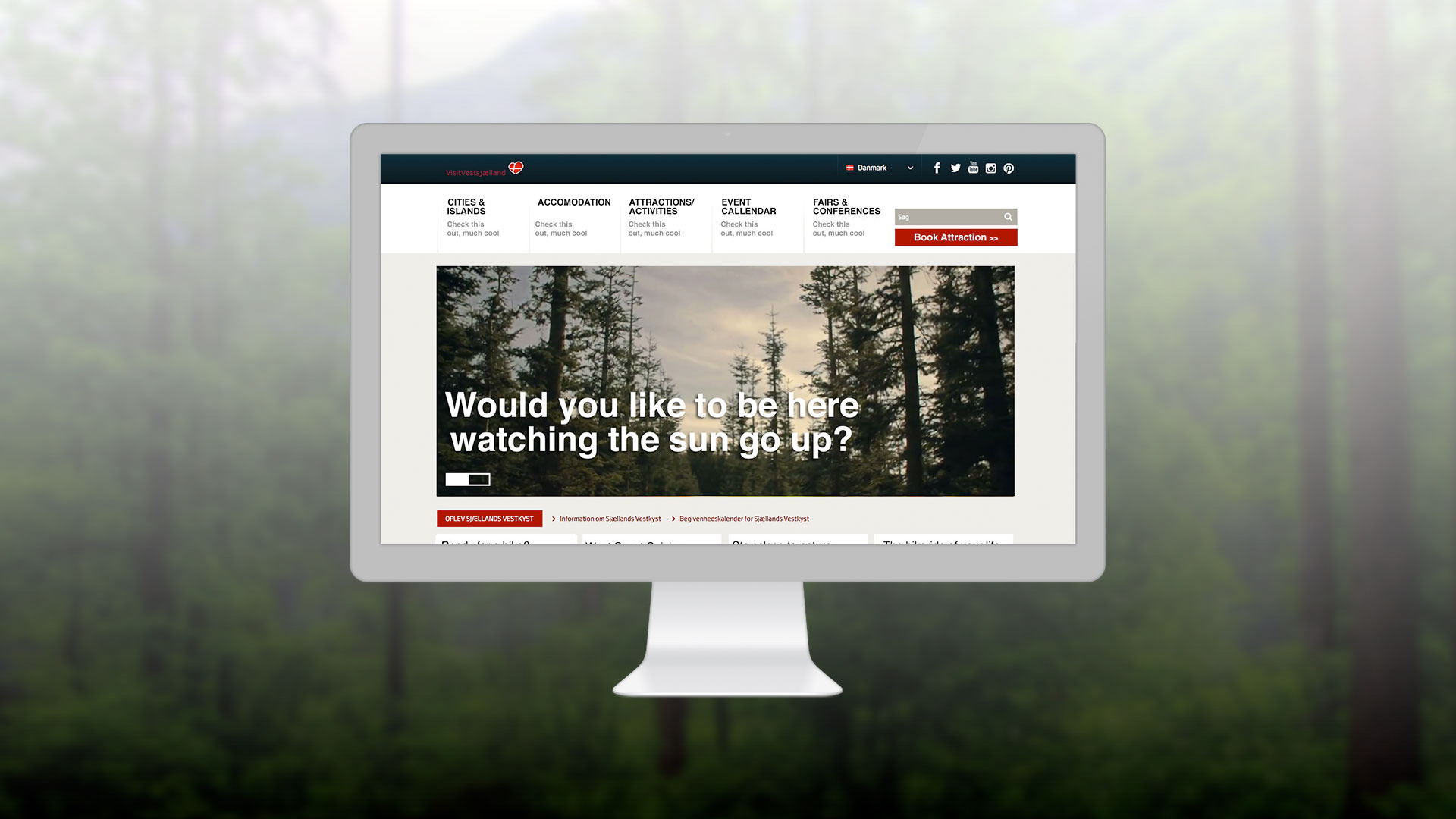
If it’s not working, something has to be done!
The tourist organisation of Vestsjælland experienced issues with traffic and engagement on their site. The idea behind the domain visitvestsjaelland.dk is to drive tourist to the area in their high and low seasons. The main demographic for Vestsjællands tourism are Danes, Germans and “Internationals” (basically anyone that is not Danish or German). The original site was available in Danish, German and English, but it was not localised, with custom content for each demographic.
All three demographics suffered from high bounce rates caused by bad UX and too "generic" content where users could not find the information or actions they needed.
But before we move on...
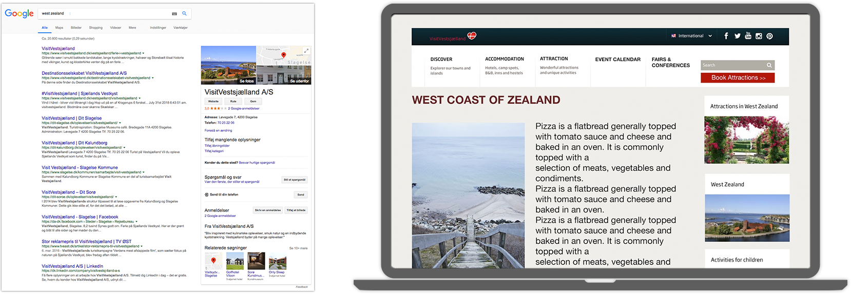
The button in the graphic below was the first (and one of the most important) UX implementation that were conducted for the re-design/organisation of the site. The three segments all had issues finding where to book attractions, hotels and tours (obviously a key business goal of Visit Vestsjælland). The button can be found in the same location on each and every site of the website, always just a click away.

Testing: Card Sorting
In order to gain deeper understanding of the cultural differences of the 3 segments, a Card Sorting session was conducted with the three segments. Card Sorting allows the end-users to structure the page content in the way that they seem fit, using Post It's. In this case we asked the groups to create their ideal menu structure through collaborating within the group.
The first group was composed by 3 Germans (2 males, 1 female), the second group was composed by 5 Danes (2 males, 3 females) and the last group was composed by 1 man from England, 1 man from Argentina, 1 woman from India, 1 woman from Norway and 1 man from Australia.
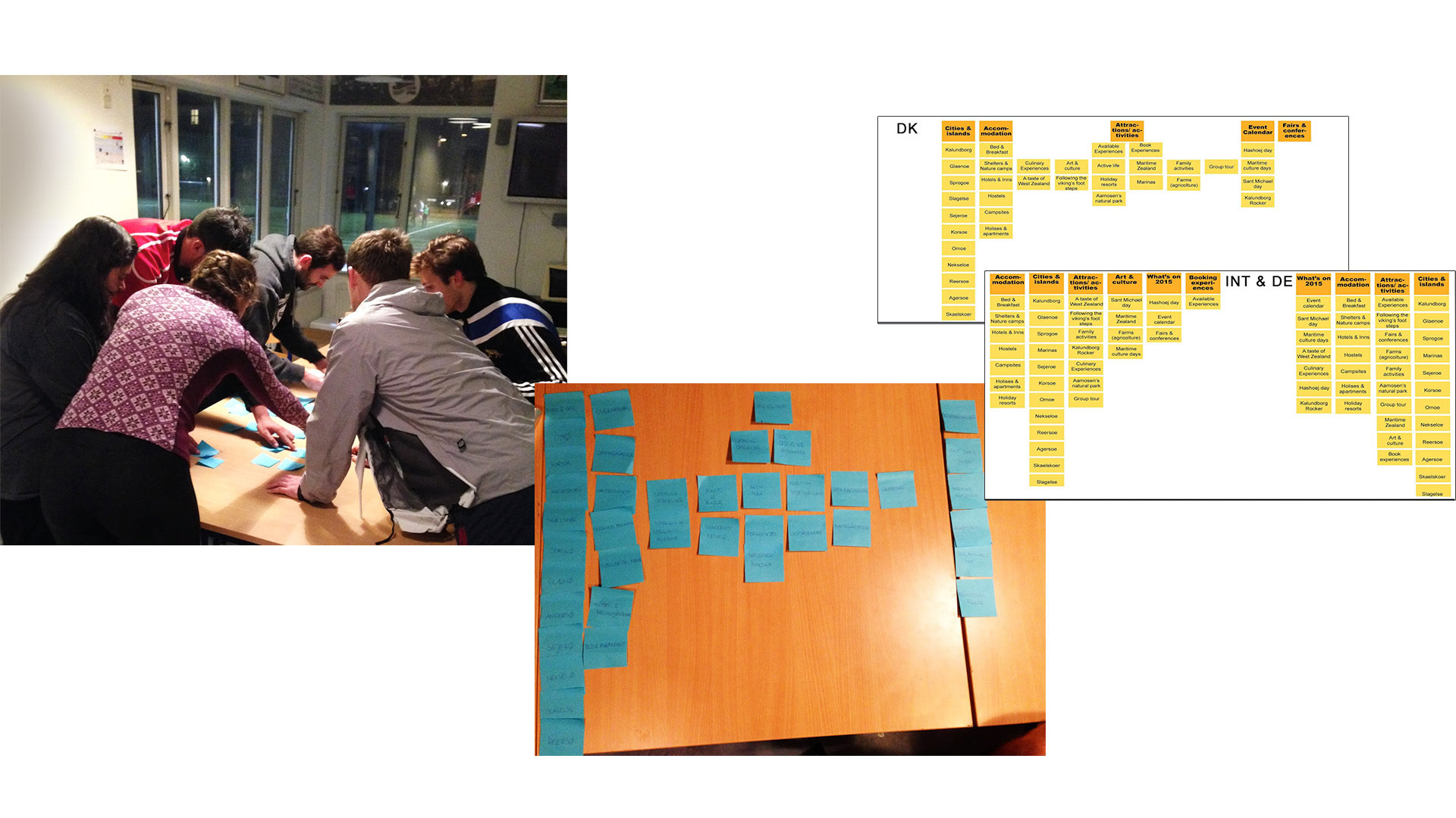
Card Sorting: How do the different demographics structure the page content
Implementation: Localisation
The International’s and Germans had a similar approach to structuring the menu’s, whilst the Danes diverted more from the rest. The general conclusion was that the site’s structure didn’t reflect any of the demographics needs. Because of this, the solution was to localise the site for each group, customising content, language and structure.
The Danes
The card sorting method revealed that the Danes have a pyramidal way of organizing content (see graphic above), for example the theme titled “attractions” was divided into two topic, that were divided themselves into 6 subtopics that were likewise divided into other subtopics.

The Germans
The German group showed a vertical way of organizing. Considering this, the menu bar was divided in 4 main themes comprehending all the subtopics.

The Internationals
The same vertical structuring that the German menu applied, was also incorporated to the menu bar of the English language website. The difference were the order of the content and on the number of themes.
Video Landing Page
A lot of the traffic to the Visit Vestsjælland site came from a previous video campaign that vent viral.
A separate video landing page was created for each segments, where the forward actions on the site differed depending on demographic.

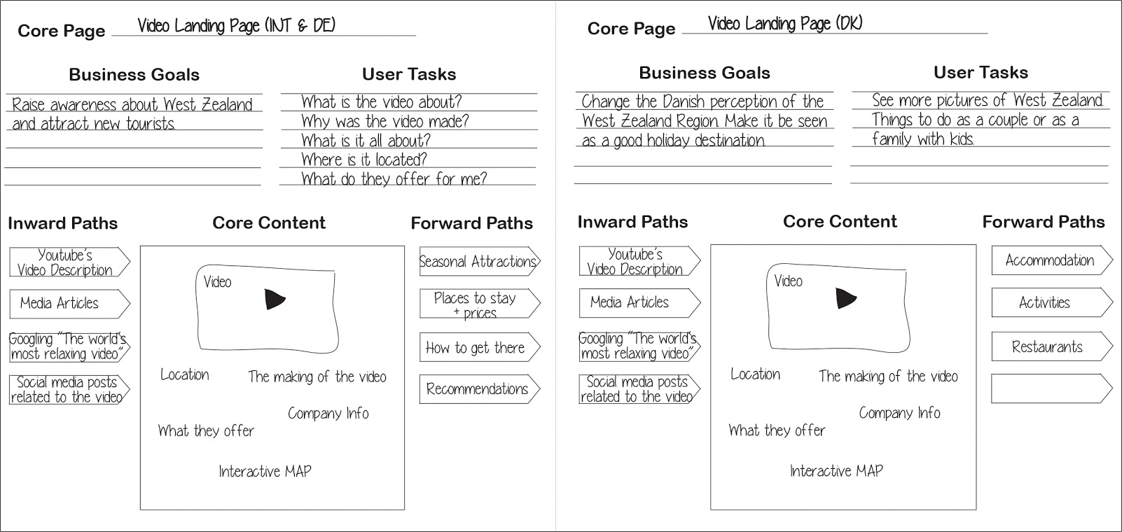
The Core Model approach was used to map out and structure all core content on the video landing page, including inward paths from f.x. search engines or Youtube, and the forward paths - the next possible action taken by the user.
Holliday Landing Page
When landing on the website after searching for a holiday destination in a search engine, all demographics reach the home page. When changing the language option, the core content of the page stays the same, but the forward paths change, depending on your demographic and what content is most suitable.

Again the Core Model approach was used to map out and structure all core content on the Holliday landing page. Here the clear difference in localisation is the outward paths, that vary depending on what the different groups prioritised as important content.
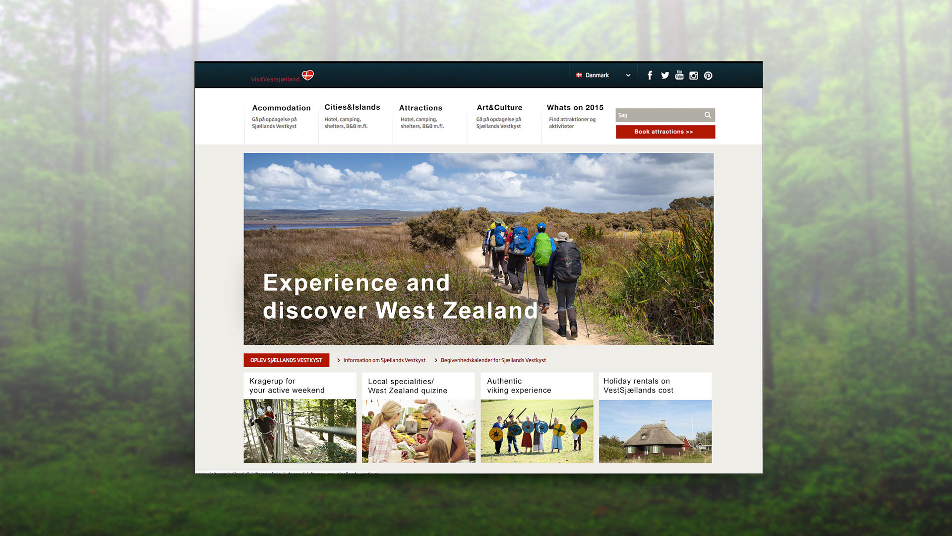
Danish Home Page
1. Menu changed according card sorting
2. Main image address Danish preference - focus on nature and the mood of the viral video
2. Main image address Danish preference - focus on nature and the mood of the viral video
The four small images:
1. Promoting nature - keeping the mood of the movie
2. Local cuisine is promoted - important for the danes
3. “Stay close to nature” live close to nature accommodation
4. Promotion for nature bike rides - favoured by danes
2. Local cuisine is promoted - important for the danes
3. “Stay close to nature” live close to nature accommodation
4. Promotion for nature bike rides - favoured by danes

Home Page Internationals
1. Menu changed according card sorting
2. Main image addresses International preference - focus on activities
2. Main image addresses International preference - focus on activities
Four small images:
1. Promoting nature activity
2. Local cuisine is promoted - important for the internationals
3. Authentic viking experiences
4. Accommodation possibilities
1. Promoting nature activity
2. Local cuisine is promoted - important for the internationals
3. Authentic viking experiences
4. Accommodation possibilities
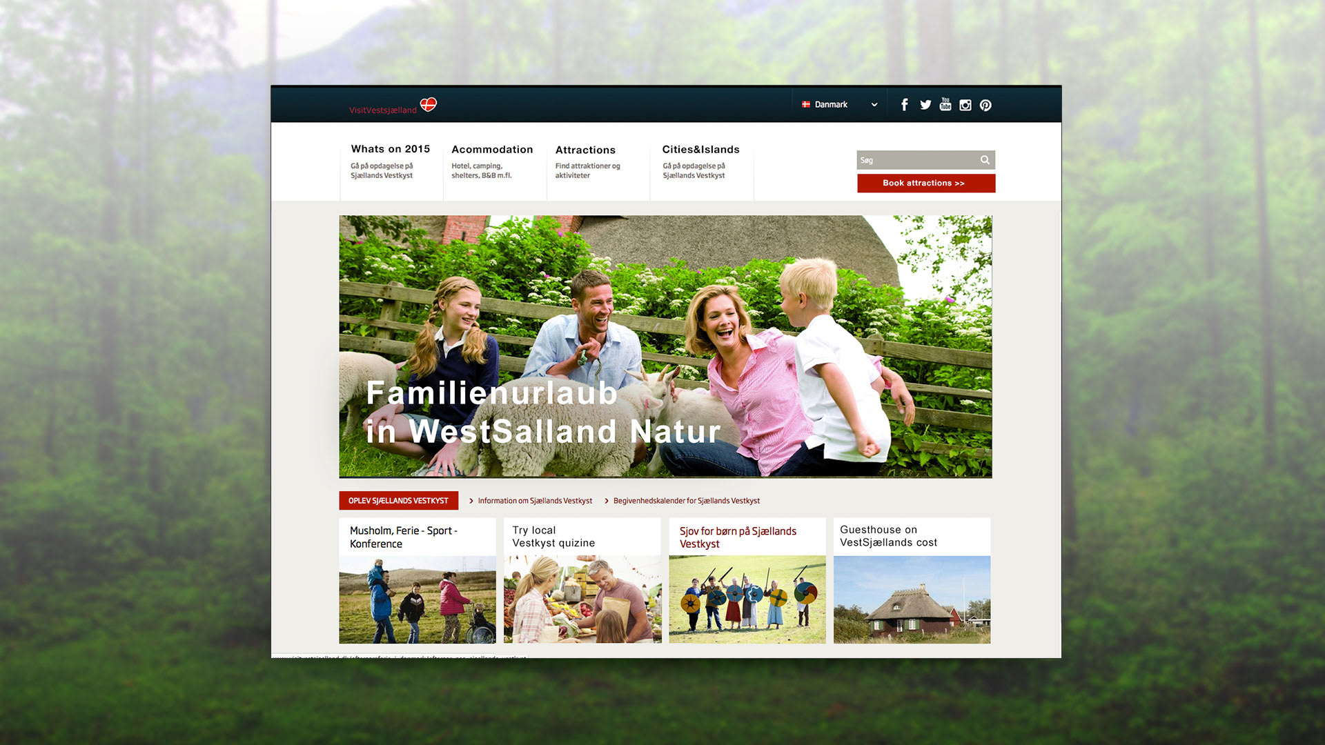
German Home Page
1. Menu changed according card sorting
2. Main image adress German preference -traveling with family / nature experiences
3. Local cuisine square
2. Main image adress German preference -traveling with family / nature experiences
3. Local cuisine square
To conclude
There are many factors that play in when designing good UX, but the main one will always be a deep understanding of your target groups. Creating digital content with the end-user in mind, requires research, testing and smart implementation. In this case a localisation strategy, starting already before the user reaches the website (search results, links etc.), helped to make a custom flow for each segment, presenting only the most valuable content and forward paths, leading to more conversions, booked hotels and tours.
Thanks for Reading